Dorm living

When I went away to college I ran the gamut of emotions. That first year was a roller coaster in so many ways, but for me, having a soft place to land was my security blanket. I certainly didn't spend my whole year in the room, but I did underestimate how it would function: library, party site (although I usually was smart enough to let my friends host the parties in their rooms), living room, vanity, bedroom. Decorating my dorm room was therapeutic. After my parents left and I wasn't sure what to do with myself, I set to work with my fun tack, hanging my U2 posters and collages of photos from home, set out my IKEA picture frames, my new banker's desk lamp and hunter green landline phone. My pink, teal, green and white madras plaid comforter set the tone, and by parents' weekend, my mom had added the perfect teal area rug and light green curtains with ribbon tie backs to our space. My roommate and I loved it. I suppose I was always a nester and came by it naturally, thanks to my mom.

My first niece is about to graduate high school, and when she asked me to help her decorate her dorm room I jumped at the chance. She knew the color scheme she wanted to work with and had already selected a pink down comforter. From there, I created three looks for her to choose from or mix and match and sent her the links to shop from. And with that, my newest design service was born: Express Dorm Design.

I create custom dorm design packages which include any and all of the items your coed needs to make their first place away from home feel as comfortable as their own bedroom. After filling out a style and needs survey on my website, I curate a collection of items to give you one cohesive look, complete with a Pinterest link for brainstorming and sharing, updated links for shopping/purchasing,  and practical notes for implementation. These packages are $150 (unless further customization is requested).

For those who don't want such a custom plan, you can shop from my gallery of pre-made Dorm Designs for $75. These are subtly themed or designed around a color scheme and come with links for shopping and brief notes for implementation. They can be customized for an additional fee, but essentially come as is.

If you're looking for a unique gift for a high school grad in your life, please keep me in mind! I'd love to collaborate with you are your grad. Both of these packages are purchased and completed virtually, so you don't need to live near me or your graduate to gift them with one.

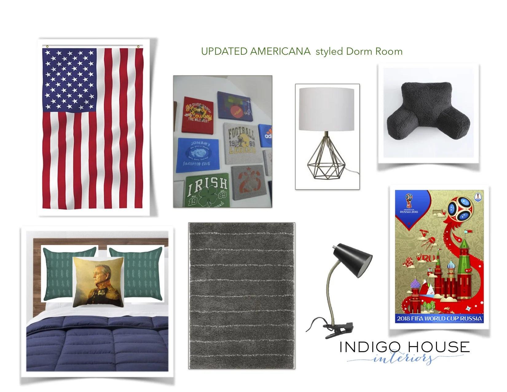
Below are a few of my Pre-Made designs. I'll be adding more every day or so. If you'd like to learn more, head to my site and click under services for Express Dorm Design or contact me.

Earth + Sky Inspired jpeg.jpg
Preppy Chic jpeg.jpg
Updated American jpeg.jpg
Pink, Grey + Gold Dorm website.jpg

Have a great weekend!

image1.png


Willing Spring to come

As I type this, I'm staring out the window at a wintry mix of snow, sleet and rain. March is rolling in like the lion she is. I'm longing for bright green lawns, pale new leaves and blue skies. The painting below, is what I'm daydreaming of right now. 

Edward Hopper's Corn Hill

Edward Hopper's Corn Hill

It is so full of light that it inherently lifts my mood. It's the kind of feeling I want to have when I'm at home on rainy days and sunny ones. Below, I'll show you how you can incorporate Corn Hill's feeling into your decor.

1. Use Nature's Palette as your starting point

Mother Nature is the ultimate designer and artist. She seldom gets it wrong. It's pretty failsafe to use her colors as a palette when you need a space that's light, bright and cheerful. 


Unknown.jpeg

sky


earth

sunlight

c4bd2bb6f399e5353d4939568a96c574.jpg

2. Use natural textures

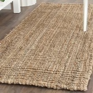
Layering area rugs is a great way to add texture, color and pattern to a space in an affordable way. Large natural fiber rugs are typically pretty inexpensive and durable. Add a patterned rug in a smaller size on top for softness and color. You can find examples of this look here.

3. Repetition

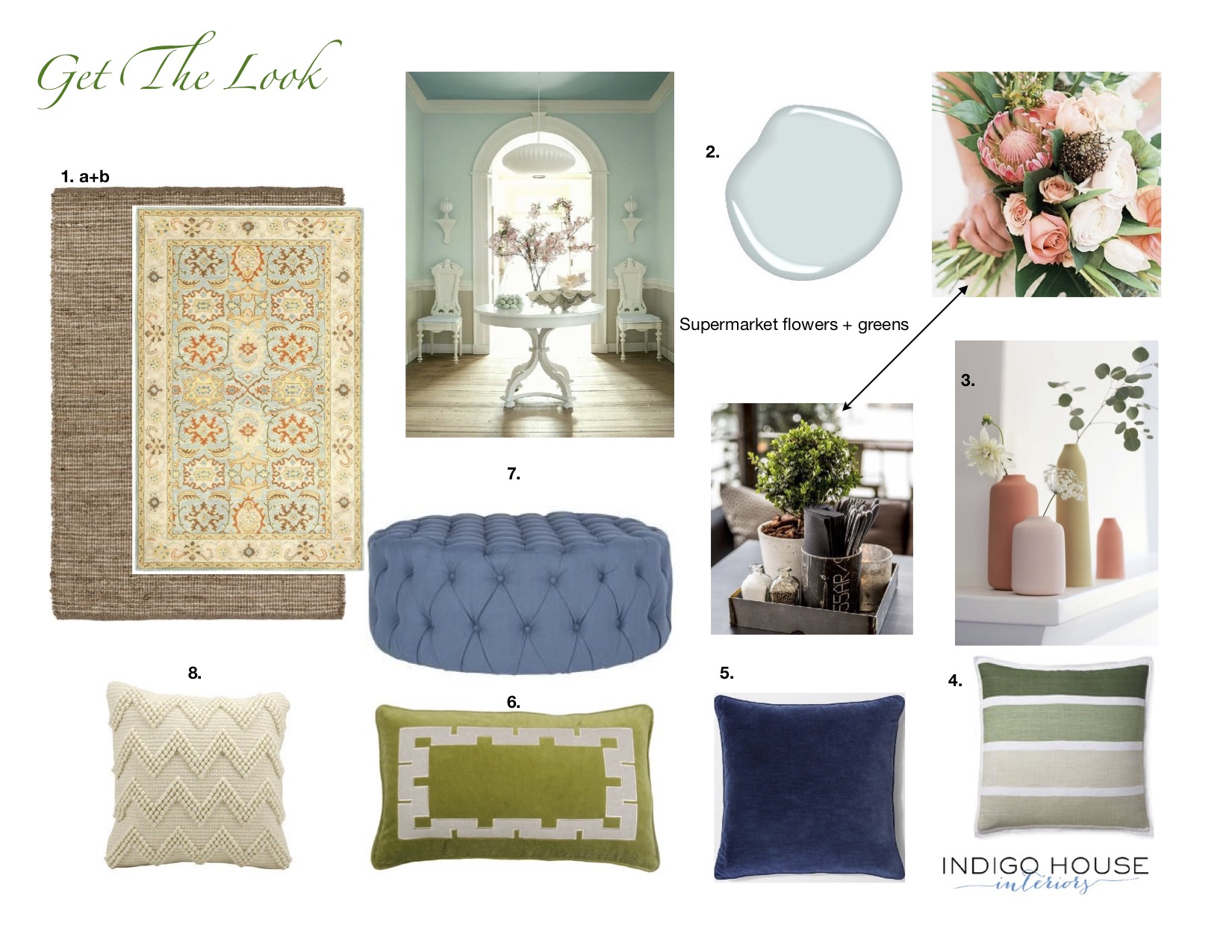
Select a color in the palette that you're most drawn to and weave it throughout your space in varying shades. Doing so feels natural, like a sky at sunset. You can start with a light blue on the walls, add a medium blue ottoman or lamp and deep blue pillows on the sofa. The board below translates the painting into decor. (Items are linked beneath it.)

Labeled JPEG-CORN HILL.jpg

1. a // b // 2. // 3.  // 4. // 5.// 6. // 7. // 8.

I've used a similar palette in my living room and it really does make me happy, even though a Nor'easter is a blowing out there! 

To help you get started on your spring decor daydreaming, I'm offering my second special leading up to St. Patrick's Day.

Today's special: 20 % off any design service! To take advantage you must:

1. subscribe to my website for news, discounts and workshop information on the sidebar or HERE

2. call or email by tomorrow, 3/4/18 to schedule your call or consultation. Deadline is 8 pm tomorrow night!

GOOD LUCK!

image1.png

Color of the month: March

When I was growing up, my mom had a knack for making every holiday and new season feel special. It was never anything too elaborate. A wreath on the front door, a colorful tablecloth, or small doses of color to coordinate with the season throughout our small house. There are times when I feel like doing so is just another item on my to-do list, but it always seemed that it made my mom happy. Being a mom is rewarding, but it's also stressful, worrisome and sometimes lonely. As a mom who has worked full time, stayed home full time and now works from home, I know these little touches can mean a lot. I realize that these details aren't just for my kids and guests, but for me too. They break up the monotony that seems to set in during winter and sets the tone for something new and fresh to look forward to.

If you feel unsure about how to do this, color is an easy way to start. It can do so much to affect and enhance our moods and can be a lot easier to live with and transition than specific holiday decor.

Since today is March 1st, I thought it would be fun to share a"Color of the Month" post with you. Throughout the month I'll share inspiration of the color here on the blog and on my social media accounts, I'll share different palettes using that color, and offer advice and tips on how to work with it.

Since spring is on the horizon, it's March and I'm Irish, this month's color is green! People seem to either love or hate green, but personally, I've always been a fan. Next to blue, it's my favorite. I've always found it fresh, cheerful, and easy to work with. Below are some inspiring designs I've found or created to get you thinking green! Monday, I'll be sharing my first of a few palettes with you and tips on how to use them in real life. Be sure to look for my special offer at the end of this post!

1. An inspiration board I created for a client who will be going for a dark, moody den makeover.

Den Scheme- GREEN.jpg

2. Preppy Green Rooms

This guest room from Kelly in the City is so cheerful and chic.. You can't get more preppy than green with navy + white stripes. I love the coastal touches and the pop of pink, and really, with the tweak of a few accents colors/patterns, it could wo…

This guest room from Kelly in the City is so cheerful and chic.. You can't get more preppy than green with navy + white stripes. I love the coastal touches and the pop of pink, and really, with the tweak of a few accents colors/patterns, it could work for almost anyone and any room. 

I love this preppy stairwell gallery wall by Maura Jane Interiors.

I love this preppy stairwell gallery wall by Maura Jane Interiors.

3. Timeless Green Looks

This bathroom is timeless and classic paired with black, white and brass finishes.

This bathroom is timeless and classic paired with black, white and brass finishes.

Playful and classic patterns in the same shade of emerald are elegant against the neutral backdrop of this room.

Playful and classic patterns in the same shade of emerald are elegant against the neutral backdrop of this room.

4. Earthy Greens

Ginnifer Goodwin's elegant living room uses an earthy green that harmonizes with the neutral palette and warm textures.

Ginnifer Goodwin's elegant living room uses an earthy green that harmonizes with the neutral palette and warm textures.

This green is soft, neutral and reminiscent of nature, making this baby's nursery one that he or she won't outgrow too soon.

This green is soft, neutral and reminiscent of nature, making this baby's nursery one that he or she won't outgrow too soon.

5. Green Accents

Here, green is a secondary color, but without it, although pretty, the room would be lacking something. Since green is so dominant in nature, it tends to work with other colors found there as well. 

Here, green is a secondary color, but without it, although pretty, the room would be lacking something. Since green is so dominant in nature, it tends to work with other colors found there as well. 

In this fun room, the solid green velvet pillow grounds the other patterns and colors and makes it feel sophisticated and pulled together.

In this fun room, the solid green velvet pillow grounds the other patterns and colors and makes it feel sophisticated and pulled together.

In this inspiration board I created for my son's room, green was the accent that balanced the fun with the tame. 

In this inspiration board I created for my son's room, green was the accent that balanced the fun with the tame. 

Saturday morning I'll have a new post ready for you with another take on "green" design. In the meantime, have a great end to your week!

TONIGHT'S SPECIAL OFFER!

Each time I post until March 17th, I'll be offering a new special. Tonight's is a free 30 minute call or consultation to talk about and try to solve your design dilemmas. Here's how to take advantage:

1. subscribe to my website for news, discounts and workshop information on the sidebar or HERE

2. call or email by tomorrow, 3/2/18 to schedule your call or consultation. Deadline is 8 pm tomorrow night!

erin@indigohouseinteriors.com 

516.660.1124

GOOD LUCK!

image1.png

GALLERY WALLS: When to use oversized mats

Last week I shared some tips about planning a gallery wall in my first #myindigohouse video. As I mentioned, for me, gallery walls are a great way to add an impact with art on a reasonable budget. They can be a great, personal solution for those large empty walls that often stump us. Your mediums can be anything you have access to or love: Etsy prints, framed souvenirs, prints and tickets from your travels, favorite photos, personal artwork and more.

thumbnail_FullSizeRender.jpg

After sharing my video, one of the frequent questions I was asked was, "Why did you use the oversized autograph mats?"

 Now it's not for everyone or even for every gallery wall, but here are my thoughts:

1. When you're looking to fill a large area like in my dining space, above, the large mats can help to unify average size pictures (easy to print and order affordably) and make them feel more like a cohesive unit, or one oversize piece of artwork.

2. The white mat draws the eye in to the picture and really helps you take note of whatever detail you're trying to showcase whether it's the color, the subject, it's shape, etc.

3. For a large grouping like mine, it will help all of those photos (which I'm still waiting for to arrive!) feel less busy than they might without them. Below are some examples of gallery walls that employ this idea. 

clockwise from L-R: Emily A. Clark (she inspired me to buy these frames), Indigo House, Pinterest, Pottery Barn

Below I've added some examples of gallery walls that are nice but miss the mark just a bit. 

I realize that anything to do with art is pretty subjective. These gallery walls really might be beloved by those who created them, and really, that's the point. I am in no way suggesting that my way is the only way.  I just wanted you to see the difference that the large mat can make. These are actually all arranged well, I just think their subjects get a little lost and feel slightly busy.

My eye goes right to the two large frames/mats and not just because they're the biggest. While the arrangement is fine, the subjects of the photos are totally lost in the small frames. Slightly larger frames and mats would pull the eye in and make t…

My eye goes right to the two large frames/mats and not just because they're the biggest. While the arrangement is fine, the subjects of the photos are totally lost in the small frames. Slightly larger frames and mats would pull the eye in and make these black and whites feel more special.

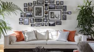
I love the color used in this arrangement. It's clear that's what this homeowner wanted to highlight. The arrangement and spacing is great, but the scale of the frames feels too small for the size of the sofa. The smaller photos would really pop if …

I love the color used in this arrangement. It's clear that's what this homeowner wanted to highlight. The arrangement and spacing is great, but the scale of the frames feels too small for the size of the sofa. The smaller photos would really pop if they were in frames with larger mats and would hold up a little better to the size of the wall and the surrounding pieces. Mixed sizes are fine and often really interesting, but in this case, bigger would be better.

Tips for hanging your gallery wall:

1. Lay your arrangement out on the floor and snap a picture with your phone as a reference (if it's abstract in shape).

2. Then plot your templates on the wall with newspaper, craft paper, wrapping paper, etc., and painter's tape to make sure you're happy with the layout. Measure between frames if creating a grid.

2. If your frames have two small hooks on each end of the frame do yourself a favor and learn from my MISTAKE! Attach framing wire between the two hooks and fasten tightly. This makes hanging them SO much easier.

3. Measure where your nail should go and mark your templates accordingly.

4. Hammer right through the paper if you like. Remove before hanging frame.

5. Use a level to make sure your frame is straight. This matters less if you're doing an abstract layout, but for grids like mine, you will notice it big time if it's crooked.

I'm already happy with how this idea fills up our blank wall. What questions do you have for me? If you've created a gallery wall, I'd love to see it! Share in the comments or on social media! Use the hashtag #myindigohouse


Have a great week!

image1.png

A Coastal Inspired Holiday

I'm a beach lover, in every season. There is something special about a winter beach. The emptiness and silence is like a blank slate. There's room for thought and space. It sort of just lets you be. This is sort of how I want December to feel in my home. I want it to be a place my family and I can come home to and just be during this time that seems to run at double speed.

This feeling is subconsciously woven throughout my home, and during the holidays, I like to complement this aesthetic with more traditional, cozy touches. For you other beach lovers out there, I've put together a quick road map with items from some of my favorite local and retail vendors that can give you the same vibe. All items are linked below it.

JPEG-COASTAL HOLIDAY.jpg

1. / 2. / 3. / 4. / 5. / 6./

1. Felicia at Blue House Summer makes beautiful, hand painted signs out of upcycled wood. I love this piece in particular because it can really work with year round decor in a casual space. She can also make custom signs tailored to your requests. Check out her facebook page or website for more examples of her work.

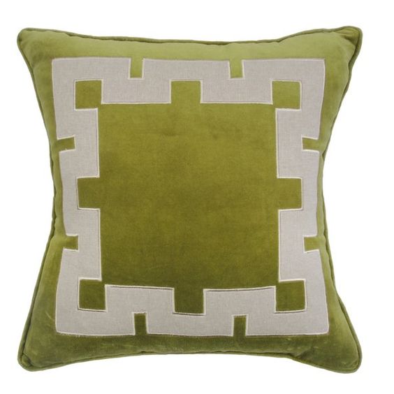
2. I am addicted to new pillows from Homegoods. I swap mine out throughout the year seasonally, or depending on my mood. Just ask my husband.  At this point, I've taken to keeping the pillows I have and replacing just the covers when I can. I'm personally ordering these green velvet covers from Nora Quinonez's Etsy shop. They're definitely pricier than picking up a whole new pillow at HG, but they're handmade here in New York, and that kind of quality is hard to beat. The green can also be a nice transition to spring later on.

3. If you have a special beach lover on your holiday shopping list, or you're looking for a piece of artwork for a prominent place in your home, Eileen McKenna' shop is a must visit. She is a local artist whose muse is the constantly changing beach. This print, entitled, Light reminds me of a winter beach and Eileen captures it all so realistically.  Be sure to check out her thoughtful blog where she shares her inspiration and process.

4. I came across this pretty wreath on Etsy. I love that it could be used for Hanukkah, or winter, or really everyday if you're a blue and white lover like me. 

5. One of my favorite shops to frequent is Anchor & Co. in Amityville. Liza is a master at breathing new life into vintage and upcycled furniture, and adding her signature coastal flair to affordable decor. These ornaments are a great gift for friends or family who've relocated out of state, or as a keepsake for your own tree.

6. This menorah from West Elm reminds me of the most elegant driftwood. It's a lovely modern and artistic update on a classic menorah. It just sold out in silver, but may still be available in person and is still available online in gold.  (Pier 1 has this more traditional version in a similar style you might like too.)

**I'd love to see how you use your coastal style during the holidays. Share pictures with me on Instagram by tagging me @indigohouseinteriors and use the hashtag #coastalholidaystyle

Until next time,

image1.png

circle of friends

Hey there. Long time, no blog. For months I've been saying to myself it was time to get back on the wagon and blog. Ideas have come and gone, usually in the middle of a mind clearing morning run or long dog walk. I'd get home with every intention of sitting down and writing and a million other parts of my day just distracted me: a sink full of dishes, a new client, laundry, bills, projects etc. Life. A good life and fortunate one, but scattered as any other woman's while trying to juggle its pieces.

On some of those morning runs and walks it dawned on me that my blog, and writing has been a touchstone since life at home became my full time focus. When my children were little and I was in the throes of new full-time motherhood and all it entailed, my first blog gave me a creative outlet and a release. It connected me, not only to other women and readers in similar straits, but to a side of myself I hadn't indulged in years.

Design school was a whole different kind of whirlwind. It took a huge leap to resign from the teaching job that was waiting for me. (picture a frazzled mom of toddlers on crutches gimping into the principal's office for comic relief.) People in my world, and even strangers said I was nuts. Nuts to give up a steady paycheck, a career I had spent time and money earning, a pension and the safety net it provided. Someone actually asked me what I would do if my husband ever left me? Seriously. Another said I was crazy to give up such an "cushy" job. Clearly someone who has never done said cushy job.

Others said I was ballsy. Ballsy because I was going out on a limb after something I had been daydreaming about for years, ballsy to try something totally out of my comfort zone. I'm not sure it was either and honestly, I don't really care.  I do know lots of people don't have these options. Going back to school and putting in those hours at night upended our routine for sure. Laundry piled up, dinners were crappy BUT I didn't have seven kids and a job like my dad's mom did, or two jobs and a child like my mom's mom did. Perspective was a good motivator.

Today, I'm somewhere between those two worlds but my blog, that touchstone, has had false starts and stops and has pretty much fallen to the wayside. From a business standpoint, I know I should be on it and schedule it a few times a week as part of my work responsibilities. From a personal standpoint, I've begun to realize I need to do that even more. 

Earlier this year, as my business started to take off a bit, I struggled with feeling both fulfilled and guilty. I also really started to miss the company of other people to work and collaborate with on a daily basis. I contemplated chucking it all and going back to the classroom. And the universe replied.

Days later, a friend of my sister in law's reached out. Among many hats, she is a blogger, an artist, a mom, a runner and an entrepreneur. We connected to talk about blogs and business and creativity and life. Our conversation invigorated me and was the jolt I needed to keep at it. It also got me thinking about all of the other talented women I know who work hard outside the home, who stay home and manage so much, who create, who share, who check us when we need it, who lead, who don't take sh*& and who nurture others.  Women have such a powerful knack for being a network for each other. It made me think about incorporating them into my blog and really, gave me the drive to get back in the saddle.

I don't want to promise a set schedule for you just yet, BUT I do plan on featuring a talented woman from my circle and beyond in some way from time to time. 

Next week, I'll have a round-up of hand-made gift ideas from a group of women in my community. Throughout the month, I'll highlight each one of them in separate posts and show you how to incorporate their wares into your home.

If you're still reading, thank you. I look forward to giving this a go and connecting with you all.

Until next week,

image1.png

A Modern Irish Restaurant

I was planning on doing a post about designing with green today. Somehow though, my wheels started spinning. I daydreamed about how I would design my version of an Irish restaurant/pub here in the states. Having waitressed in one for several years and visited my fair share of them here and in Ireland, it somehow seemed fitting today. 

I envisioned it as a place for a casual meal but with a bit of refinement. You'd get a modern take on traditional Irish and American cuisine, but nothing would look or taste pretentious. It would be a simple space inspired by some rustic and traditional elements of Irish homes, warmed by a fire, reflecting the colors of the Irish flag ever so subtly. It would be a space to gather over delicious food and drink and share good craic. There'd be live music, both new and old, the artwork would reflect the history and culture of Ireland and the Irish in America, but simply done. There would be work from local artists of pastoral scenes, seascapes, cityscapes and photographs of smiling, laughing faces.

As you can see, there would be lots of texture, wood, linen, and leather (vinyl). The walls would be whitewashed. The dishware and glassware seen above is from the well know Irish glassblower, Simon Pearce, who now lives in Vermont.

For me, this embodies the warmth I remember from Irish homes and the comfort I've always found in special Irish haunts here in New York. I guess that's what was on my mind and in my heart today. There's more about that, in my extra post below this. I feel very lucky to have experienced these places in my life and to be able to express it in my work.  

Whadd'ya think? Read for some fish and  chips and a pint? I'd love to create this space somewhere for someone. 

If you're celebrating today, wherever you are or end up, I hope the gifts of the Irish that inspired me today, are with you.

Happy St. Patrick's Day!

indigosignature_gold.png

If you're lucky enough to be Irish...

St. Patrick's Day is nostalgic for me. In high school, I marched in the St. Patrick's Day Parade in New York each year with the marching band.  We always performed "New York, New York" and to this day, when I hear that song, I remember my whole swing flag routine. I also remember falling in my slippery white go-go boots in front of Central Park. Even with the drunks heckling me, I wasn't phased.

I was lucky enough to be Irish and marching down Fifth Avenue.

Then I went to school in Ireland for my last semester of college and felt more American than ever.

I remember sharing pints in Cavan when one of my Irish cousins asked me, "Do you feel Irish?" 

I didn't know how to answer that question.  In New York, people automatically assume that I'm Irish because of my name and how I look. 

In Ireland, there was no question I was a Yank.

My grandparents, Mary & Ben Conaty near their building in Greenwich Village, NY in the late 50's.

What I do know, is that St. Patrick's Day and feeling Irish have a lot to do with my family and traditions.

I love this photo of my grandparents for so many reasons:

The vintage quality. The window into that era. The story that I conjure when I look at it.

They look happy.

I don't have too many memories of my grandmother being well,
but I have a ton of my grandfather.

He was a tough man in many ways.

There was a lot about him that was hard to love.

There was a lot about him that was mysterious to me.

He was often grouchy and a curmudgeon.

He was a bit like Archie Bunker.

But to me, he was also funny and sarcastic, and I loved him.

I know he was not an easy man to have as a father.

He was not your typical doting grandfather either,

but he had a soft spot for me and we had a special bond.

I know his life was hard.

I'm not sure just how so, but I think it made

him who he was, for better or worse.

He was the oldest of many children.

He left Ireland alone, around the age of 20  and never went back.

Didn't keep in touch.

Didn't want to talk about it. 

Told me not to visit Ireland.
"They won't let you in when they hear your name is Conaty."

Mysterious. Curmudgeon. Grouchy. Sarcastic.

Not long before he died, over Thanksgiving dinner,
he told my brother and cousins and I
stories of his speakeasy hopping days with my grandmother.
Soon after that, over tea at his kitchen table,
he told me about meeting my grandmother on the ship
when he emigrated from Ireland.
They were both from Cavan, he from town, she from the country.
They lost track of each other until fate intervened
a couple of years later at a Cavan Ball in New York.

I am so grateful that as he aged, he told me these stories.
The man was usually an oyster,

but he was an impeccable dresser.
Even during a heat wave, he wore long slacks and a button down shirt. 

I remember seeing him in his fedora.

Maybe that's why I love that Eamon suddenly wants to wear bow ties.

He came to this country, worked hard and raised seven children with my grandmother, who I hear was pretty saintly. I wish I had known
her longer and better.

He died when I was nineteen.

I miss him and think of him nearly every day.

St. Patrick's Day is just a way for me to feel connected to him, to be proud to be his granddaughter, to have carried his name and hopefully have learned from his life. I think he would be proud and even softer today if he could see these two kiddos, who are lucky enough to carry a little piece of his Irish along with them.

My kiddos, back in 2012 when I originally wrote and shared this post.

Happy St. Patrick's Day!


Living Room Progress

Well, it's been a couple of weeks, and slowly but surely, our living room is coming together. If you follow me on Instagram you've seen a bit of how it's evolving. Adding the new rug, sofa and dining area has already made a tremendous impact in brightening up the space and using it more efficiently. To recap, here are a couple of shots of the space a few weeks ago.

With northern light (and not much of it), an imbalanced layout and lots of beige and cool blue, the space felt dull and flat. The remedy? Working with the warm undertones of the floor to brighten up the palette.

And Here's where we are today. *Disclosure: These are real-life pictures. I live with children, a 100 pound dog and a constantly running washing machine. As soon as the place is straightened up, it's almost just as quickly not. 

I'm still not certain about this layout. From a functional standpoint, it works well. Aesthetically, I'm not so sure. I'd love to have the sofa under the window, but the tv watchers in the house are fighting me on that one. So far, though, I'm happy. Just the added color from the rug cheers things up so much.

And here's us actually using the space.

Left to do?

  • paint

Here's what I'm considering:

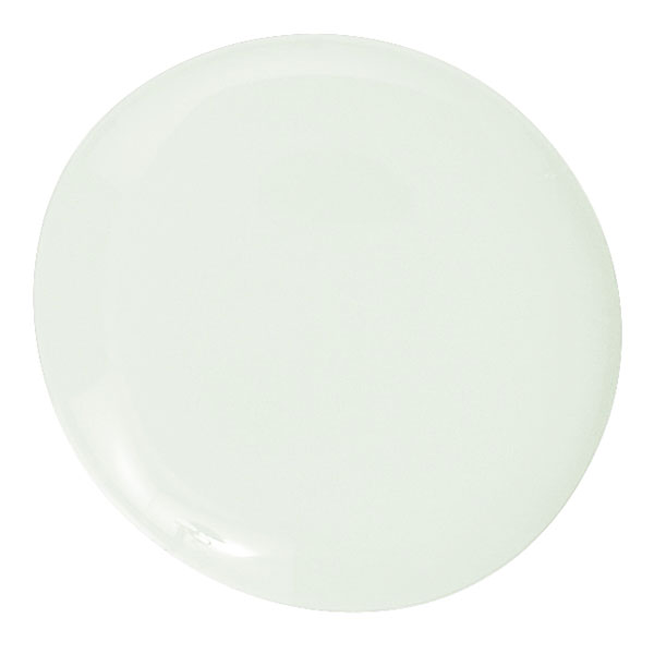
l-r, all Benjamin Moore: Opal Essence, Healing Aloe, Man on the Moon, Mayonnaise.

  • add new light fixtures
  • add new pillows to the sofa & church pew/dining bench
  • stencil or wallpaper entry and wall at top of stairs
  • add ship lap to the dining room wall
  • new blinds/drapes
  • new ottoman
  • new railing
  • add a coat closet to entry 
  • streamline the space under the window (it's bugging me)

Stay tuned for more. What projects are you working on these days? Has anyone gone with a creamy toned wall color? It's a tricky color to get right. I'd love to hear what your current favorite paint colors are.

Living Room Revamp

I'm going to preface this post by saying I know I think about these things way too much. Probably far more than is normal for most. Nothing you'll find here is earth shattering or terribly important in the grand scheme of what's going on in our world today. However, creating, puzzling over and enjoying my spaces really bring me great joy. They offer a soft place to land that can feel like a refuge from the stress of all the other stuff.  There's certainly enough to feel crabby and frustrated about outside these four walls. I need the ones inside to feel good. When they're not working, I feel off, and so does everyone else I live with.

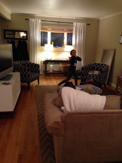
Over the years, my living room has been the one room I've struggled to pull together well. It's one long, narrow room that only feels balanced when the Christmas tree is up. Not so helpful for the other eleven months of the year. It also has no overhead lighting, few windows, and the light we do get is cool, Northern light. In the dead of winter especially, this drives me bananas. Coupled with the beige walls, rug and sofa we have, there are days I feel like I'm living inside a cardboard box. It seems though, that the more I try to tweak and work something out, the more I get stuck. It's like I can't get out of my own way and see the space with any objectivity. I nitpick and hem and haw and become my own worst client.

Through trial and error over the last few months, (and lots of texts to good friends with great eyes) I think I've gotten to the bottom of it. The answer?  I need light. When you have none or very little, that means color. I think when I was in the thick of being a mom to toddlers, all the color that surrounded me everyday made me crave the neutral. The quiet. The tame. Now that we've all moved on a bit, it's time to bring in the bright, cheerful colors that reflect where we are in life now and how we feel today. (Trust me. That does not imply that we are bright and cheerful people all the time ; )

Here are a few recent shots of the room. 

Cardboard box syndrome: Lots of beige with some blue and white and laundry mixed in. 

Cardboard box syndrome: Lots of beige with some blue and white and laundry mixed in. 

Since this room was originally two spaces, it's rather lopsided with one end of the space being emptier than the other. This is usually where we drop the groceries. The coffee table is under the window here, in limbo, in the midst of my post-Christm…

Since this room was originally two spaces, it's rather lopsided with one end of the space being emptier than the other. This is usually where we drop the groceries. The coffee table is under the window here, in limbo, in the midst of my post-Christmas rearranging frenzy. 

One of many layouts I've tried since my husband picked these chairs out before Christmas.

One of many layouts I've tried since my husband picked these chairs out before Christmas.

The Chevron rug competes with the new chairs. The Ikea sofa table from our first apartment is too small. And I want color that starts from the ground up.

The Chevron rug competes with the new chairs. The Ikea sofa table from our first apartment is too small. And I want color that starts from the ground up.

There are some pieces that are newer purchases that I love, but after 13 years of not updating too much besides pillows, a little facelift is due. Out with the greige, overscaled, saggy, dirty sofa and in with cleaner lines and more contrast.

Here's the plan I've been working on.

The rug just arrived yesterday. It's a vintage Persian rug I scored on eBay for less than the price of something synthetic from a big box store. It's 100% wool so it will stand up to my kids and 100 pound dog and all the gross things that go along with having both. The rest of the plan sprang from pieces I already have and colors that will play well with them and bring light to the room. I wanted a sofa with washable (bleachable) slipcovers, hence the white sofa. I know it sounds insane. But after reading Emily A. Clark's take on them here, as well as a few others, I think I'm up for the challenge.

So here's the to-do list:

  • Add new sofa
  • Lay new rug
  • paint
  • add new light fixtures
  • add new pillows
  • stencil or wallpaper entry and wall at top of stairs
  • add ship lap to the dining room wall
  • have cushion made for dining bench/church pew
  • new blinds/drapes
  • add more light (opening up the ceiling or walls for new windows and recessed lighting, sadly, is out of the question right now.)

If you follow me on Instagram or Facebook, you can see some close-ups of new additions to the room as I add them.

Is there a space in your home that totally puzzles you? Please say that I'm not alone! Do any of you have a white slipcovered sofa? I'd love to hear your experience. My fingers are crossed that they're good.


Decorating on the fly...

I don't know about you, but Halloween is closing in on me pretty fast. I dragged up the boxes of decorations at the beginning of the month and felt pretty impressed that I got a head start. And then life happened. A family funeral, a visit from my parents and brother, a long weekend in Plymouth and short weekend upstate. Lo and behold, October is almost gone and said boxes are still sitting under my dining room table.  It's time to go with what I've got and finish up by decorating on the fly. 

Here are a few tips to help you make do with what you've got and not reinvent the wheel when you're decorating for the holidays.


Look to mother nature. 

Whenever I can, I try to incorporate the inevitable extra pumpkins we pick up throughout the month, both inside and out. In a small space like my living room, a little really goes a long way.

Here some small pumpkins and gourds sit atop a wooden tray and add a fun touch to an out of the way corner of our living room. With some dollar store decorations, they get a little spooky for Halloween.

Here some small pumpkins and gourds sit atop a wooden tray and add a fun touch to an out of the way corner of our living room. With some dollar store decorations, they get a little spooky for Halloween.

Embellish the ordinary.

With little time and budget to buy or make a new wreath last year, I added a Thanksgiving sign I already had to a simple grapevine wreath I found in my basement. (If you're local, you can get something similar made for you here.) Adding some faux and real pumpkins to our stairs creates a warm welcome to our tiny entry. 

Create a grouping of like items.

You don't need to spend a ton to make an impact. My husband is forever coming home with decorations from the drug store that I would never think to buy. Instead of "misplacing" them in the back of the closet (which is usually my first thought), I try to get creative to make them work. Here, I added a creepy bunch of styrofoam skulls that he bought last year to a glass hurricane. The kids love it and I don't have lots of little items scattered throughout the room.

Shop your home with color in mind.

Instead of immediately going to buy new items, shop your home first. Look around to see if you've got old books, tablecloths, pictures, etc. that suit a holiday or season's color scheme. I found these books in a box in my basement. Grouped together, they create a fun vignette and make another one of my husband's Rite Aid pick-ups work pretty well.

To add to this bargain item's "charm", it lights up and changes color each time the damn dog barks.

To add to this bargain item's "charm", it lights up and changes color each time the damn dog barks.

I'd love to see how you decorate for your kiddos' favorite holidays. Share your photos with me on Instagram or Facebook!

Ever tweaking

Just like my home, I am forever tinkering with my blog and website. It always seemed to feel off to me that my blog was identical to my business page. Blogging is really where everything started for me, so it made total sense for me to separate the two a bit. Since I wasn't able to export the content from the original site over to this new page, I'm starting fresh. There is nothing I love more than a clean slate!

So, bear with me as I create new content. I want this site to share my projects and offer me the freedom to write about the non-design inspired things that are just as much a part of my life and I'm guessing, yours too.

Thanks for sticking with me. I'll be back soon.