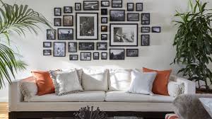
Last week I shared some tips about planning a gallery wall in my first #myindigohouse video. As I mentioned, for me, gallery walls are a great way to add an impact with art on a reasonable budget. They can be a great, personal solution for those large empty walls that often stump us. Your mediums can be anything you have access to or love: Etsy prints, framed souvenirs, prints and tickets from your travels, favorite photos, personal artwork and more.
After sharing my video, one of the frequent questions I was asked was, "Why did you use the oversized autograph mats?"
Now it's not for everyone or even for every gallery wall, but here are my thoughts:
1. When you're looking to fill a large area like in my dining space, above, the large mats can help to unify average size pictures (easy to print and order affordably) and make them feel more like a cohesive unit, or one oversize piece of artwork.
2. The white mat draws the eye in to the picture and really helps you take note of whatever detail you're trying to showcase whether it's the color, the subject, it's shape, etc.
3. For a large grouping like mine, it will help all of those photos (which I'm still waiting for to arrive!) feel less busy than they might without them. Below are some examples of gallery walls that employ this idea.
clockwise from L-R: Emily A. Clark (she inspired me to buy these frames), Indigo House, Pinterest, Pottery Barn
Below I've added some examples of gallery walls that are nice but miss the mark just a bit.
I realize that anything to do with art is pretty subjective. These gallery walls really might be beloved by those who created them, and really, that's the point. I am in no way suggesting that my way is the only way. I just wanted you to see the difference that the large mat can make. These are actually all arranged well, I just think their subjects get a little lost and feel slightly busy.
My eye goes right to the two large frames/mats and not just because they're the biggest. While the arrangement is fine, the subjects of the photos are totally lost in the small frames. Slightly larger frames and mats would pull the eye in and make these black and whites feel more special.
I love the color used in this arrangement. It's clear that's what this homeowner wanted to highlight. The arrangement and spacing is great, but the scale of the frames feels too small for the size of the sofa. The smaller photos would really pop if they were in frames with larger mats and would hold up a little better to the size of the wall and the surrounding pieces. Mixed sizes are fine and often really interesting, but in this case, bigger would be better.
Tips for hanging your gallery wall:
1. Lay your arrangement out on the floor and snap a picture with your phone as a reference (if it's abstract in shape).
2. Then plot your templates on the wall with newspaper, craft paper, wrapping paper, etc., and painter's tape to make sure you're happy with the layout. Measure between frames if creating a grid.
2. If your frames have two small hooks on each end of the frame do yourself a favor and learn from my MISTAKE! Attach framing wire between the two hooks and fasten tightly. This makes hanging them SO much easier.
3. Measure where your nail should go and mark your templates accordingly.
4. Hammer right through the paper if you like. Remove before hanging frame.
5. Use a level to make sure your frame is straight. This matters less if you're doing an abstract layout, but for grids like mine, you will notice it big time if it's crooked.
I'm already happy with how this idea fills up our blank wall. What questions do you have for me? If you've created a gallery wall, I'd love to see it! Share in the comments or on social media! Use the hashtag #myindigohouse
Have a great week!


